Today’s wrong question is: “Do you support a strong national defense?”
It’s the wrong question, because… of course you do. Everyone does. The question itself is meaningless; it’s like the political equivalent of asking whether you support cute puppies.
Since 1969, Gallup has asked Americans whether military spending is “too much, too little, or about right.” For over fifty years, published as if it’s useful data. It’s not. Now, I generally love Gallup; my grad school experience was connected to Gallup, and many of my professors were Gallup senior scientists. But this question is stupid.
Why? Because I don’t think most of us know what the military budget actually is, and more importantly, as you’ll see, even if we do know the number we have no good way to understand what it means.
This pattern — asking for your opinion while withholding the facts required to actually form one — isn’t unique to our military budget. It’s standard operating procedure of U.S. political discourse. This fog is everywhere… and it’s not really an accident.
Today, we’re going to talk about a system that’s been structurally engineered to keep you from knowing what your money is actually doing, and why the future needs us to do something very different.
The Numbers We Can’t Hold
Understanding what’s going on with our budgets doesn’t actually start with the numbers, but with a better understanding about human brains.
The human mind evolved to track small numbers: children, predators, days until winter. “When’s it gonna snow, where’s the saber-tooth tiger, and where the frick did my kids go?”
But our global societies are so immense and so complex now that running them in small numbers simply isn’t possible. Our brains comprehend relatively small digits, but our budgets operate in the trillions.
This is a big problem, because we are simply not equipped, neurologically, to comprehend what a billion of anything means, much less a trillion!
And that means we’re not talking about a “knowledge gap,” but a kind of “cognitive ceiling.”
Let me share a few examples. I’d like to say they will help you understand how big numbers work, but I think it’ll probably just help you see that we really can’t understand them.
Back in my episode about Compound Change, I talked about the “folding paper” experiment that says if you could fold a piece of paper in half 42 times, it would reach the moon.
That seems ridiculous, but it’s absolutely true. It’s relatively simple math, but it breaks our brains. Every fold doubles the thickness: once, twice, four times, eight times. At 42 folds, you’ve actually gone beyond the 239,000 miles it takes to reach the moon.
These kinds of numbers don’t really compute for us.
Here’s another one: Did you know that 1 million seconds is about 12 days… but 1 billion seconds is 32 years?
Our brains struggle mightily with this relatively simple switch from million to billion.
But now our budgets are in the trillions.
Numbers of this size are truly brain-paralyzing, but let me try to explain a trillion this way…
If you had started spending one million dollars every single day — not since you were born, not since America was founded, but since the day Jesus of Nazareth was born — you still would not have spent a trillion dollars. From year zero to today is about 741,000 days. At a million per day, that gets you to roughly $741 billion. To reach a full trillion, you’d need to keep spending your million a day for, oh… only another 700 years.
Now multiply that number by 1.5 and you’ve got the proposed military budget for 2027.
This is what Gallup’s asking if you have an informed opinion about.
We need better ways to see this data, my friends.
When we approach budgets with just enormous, literally incomprehensible abstract figures, the system, and the people profiting from it, win twice. First, oftentimes, by just not publicizing the figure much. But then again by knowing that even if you see the number, you can’t feel it.
A trillion dollars is completely indecipherable in the context of real life… and my concern is that the people who write these budgets understand that better than most.
The U.S. Budget Fog
If this opaqueness were the case in just one part of our budget, it might be manageable. But I don’t think that’s what we’re dealing with. I think this lack of transparency is a pervasive issue that likely cuts through most of our current governance budgets.
Let’s look at just a few examples of the crazy fog surrounding these things.
Example #1: the military budget. The current U.S. administration just proposed a 42% increase to what was already the largest defense budget in U.S. history (and was already more than double what China spends). Where does this extra $660 billion for “war” come from? What exactly is it for? Why do they need it? Don’t misunderstand me: the world’s genuinely unstable and national defense matters. My point isn’t that defense spending is wrong, it’s that citizens should be able to understand what they’re being asked to fund. The fog makes this impossible for us.
Example #2: the tax code. Did you know Americans spend 6.5 billion hours every year just preparing their taxes. When we convert that lost time into wages, and add what people pay accountants and software just to figure out what they owe, the total cost of this confusion, just to do the frickin’ math, hits $414 billion annually. And more than 61 percent of Americans still don’t understand basic tax concepts even after all that math! Oh, and also, in that fog, thousands of pages of tax code loopholes quietly redistribute money upward to the very small number of people who can afford to hire full time CPAs to find the holes.
Example #3: Social Security and Medicare. Together, these are the largest portion of federal spending, consuming roughly half the entire federal budget. And yet almost 60% of us say we spend too LITTLE on both healthcare AND Social Security!
My conclusion: most of us don’t have a frickin’ clue what’s going on with these numbers, even if we think we do.
Let’s do one more quick test. No judgment, most people fail this… ready?
What percentage of the federal budget goes to foreign aid?
The average American answer is 31%.
The actual number is… right around 1%.
Not 20%.
Not even 10%.
1%!
Americans think we spend 30 times more on foreign aid than we actually do. And here’s the real kicker: when those same Americans are asked how much we should spend on foreign aid, they say we should “cut it”… to 10%.
Which is still ten times the actual number.
People are forming strong opinions — and voting on those opinions! — about a budget item it seems they have never once seen accurately represented.
Let me be explicitly clear: this isn’t some kind of partisan left/right problem. Both sides live inside this confusion, they just argue about different parts of it. The fog is bipartisan.
Which means the antidote is, too.
This is a clarity issue.
Democracy requires informed participants. Not perfectly informed, not expert-level informed, but grounded in basic facts about where the money goes.
I don’t think that baseline exists. And I think it doesn’t exist because the system has evolved to reward its absence. Confusion benefits the people who already know the numbers. Clarity threatens them.
Which brings us to the most striking part about the research on budget misperception: there’s almost none of it.
The foreign aid misperception was studied recently because someone, you might remember, tried to remove all the foreign aid. The military spending misperception surfaced as a side finding in the Reagan Institute’s annual defense survey. The Social Security and healthcare findings came from a poll that was done for tax day.
As far as I can tell, nobody has ever commissioned a comprehensive, systematic study of what Americans actually understand about where their tax dollars go.
On the one hand, it shocks me that we have run this country for 250 years without ever seriously asking this question.
On the other hand, it’s exactly what I would expect, because it’s another matter of incentives. We need to follow the money! The powerful benefit when things are opaque, which means powerful people have to actively work against their own incentives to make things transparent.
Here’s what we do know: when people get a better understanding of where their money goes, they change their minds instantly. In that poll from the Bipartisan Policy center, opinions on government efficiency shifted 12 percentage points in a single sitting when they got better information.
Shocker: when people actually know what’s happening, things get better!
Clarity works. We’ve just never really tried it at scale.
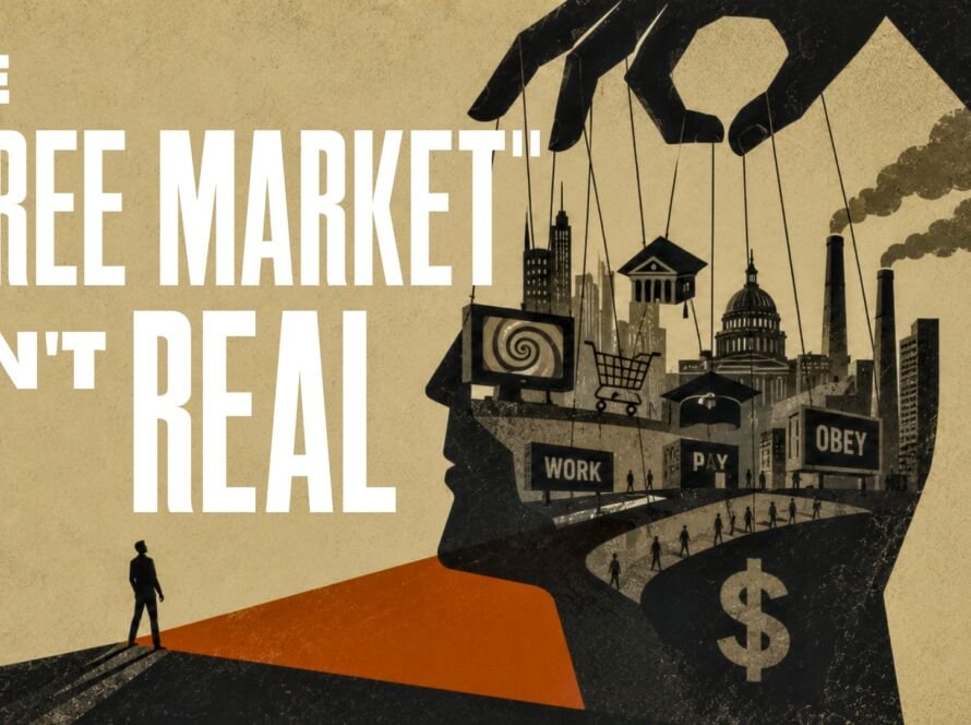
The Architecture Of Confusion
Let’s call this what it is: a system doing what it’s designed to do.
This is all systems CAN do.
Dwight Eisenhower — Supreme Commander of Allied Forces in World War II, two-term Republican president — warned us about this with our defense spending in his 1961 farewell address. He called it the “military-industrial complex:” the merger of a massive defense industry with the federal government, creating what he called “the potential for the disastrous rise of misplaced power.”
That was 1961.
We, um… didn’t listen to him.
And the same basic architecture — industry captures government, government shapes the information environment, the information environment keeps the public in the fog — has replicated itself across defense, taxes, social security, and probably more.
Please understand: this is NOT some kind of conspiracy. It’s kind of the opposite! A mature version of a system like this doesn’t need to lie.
It just needs to keep the numbers abstract, and keep the debate emotional:
“Don’t you support our troops?”
“Do you really want to wait 6 years before seeing your doctor?”
“Do you hate American business?”
“Socialism! Communism! etc. etc.”
Keep the debate hot and emotional, instead of letting the conversation become concrete:
“Do you support this specific allocation of this specific sum, compared to these specific alternatives?”
We don’t get that kind of data right now!
At a certain scale, complexity stops being a technical problem and becomes a governance strategy. When a system is incomprehensible, it becomes unaccountable. Abstraction becomes insulation. At that point, the fog isn’t a side effect — it’s the product.
There’s a name for this in economics: information asymmetry.
The people who write the budgets, negotiate the contracts, and draft the tax code know the numbers.
You don’t.
That gap is a feature of a system that benefits from your confusion.
When people don’t know the numbers, they vote on… vibes. And when people vote on vibes, the people who control the emotional framing win.
And here’s the part that closes the loop…
When government is kept deliberately opaque — when budgets are incomprehensible, prices are hidden, and tax codes require professionals to decode — the inevitable result is people conclude that government is broken. Wasteful. Incompetent. Can’t do anything right.
It’s a society-level self-fulfilling prophecy.
“Government can’t be trusted to run healthcare.”
“Bureaucrats will just waste the money.”
“The private sector always does it better.”
These aren’t organic public opinions arriving independently from millions of frustrated citizens.
You have almost certainly internalized this narrative, as have I, but that’s not because it came from us.
And it’s not even because it’s true.
These messages are the predictable output of a system designed to produce exactly the level of frustration we are experiencing now — because confused, exhausted citizens are far more likely to support the continued dismantling of public institutions than actually-informed citizens would be.
The “incompetence narrative” is the cover story.
The opaqueness is the mechanism.
And the beneficiaries are the same people who wrote the budget in the first place.
Follow the money.
The Commons Will Have Radical Transparency
What do we do about this?
I think we already know what this fix looks like. We’ve seen it — in our personal finances.
Do you remember an online software called Mint? Yes, I know Intuit bought it and eventually killed it, but a lot of folks I know remember Mint fondly. If you’re not familiar, Mint was a personal finance app that took your bank data — every transaction, every subscription you forgot about, every embarrassing Amazon purchase — and put it all in a simple dashboard you could actually read.
Pie charts. Trend lines. Spending by category. You could see, at a glance, exactly where your money went.
Mint was built on data that already existed — your banks and credit cards had all of it the whole time — Mint just made it clear. Mint showed you exactly where every dollar went: categorized, visualized, searchable. You got to see that you spent $540 at Starbucks in March and feel appropriately judged.
You’ve hopefully heard me talk about The Commons in past articles. (If you haven’t, check out this one.)
Basically, The Commons is the parallel economy I believe we need to build. Its organizing principle is that certain things — healthcare, housing, education, childcare… things we need to live — should not be subject to the profit motive.
Embedded in that principle is something equally non-negotiable: the people funding The Commons have the right to see what they’re funding. All of it. In real time. In an understandable way.
Here’s what I’m proposing: everything in The Commons is digitized and represented exactly like your old Mint dashboard — visualized clearly, in charts, for every person, in plain language, showing precisely what their contributions are funding.
You paid in.
Here’s what it built.
Here’s what’s being proposed for next year.
Here’s the trade-off on the table.
Want to see comparisons? Easy! Toggle here and see healthcare versus defense. Or education versus corporate subsidies. Housing versus contracts.
All of it visible, comparable, tied to our actual dollars.
Think back to the beginning of this episode; when presented visually like this, we’d actually be able to comprehend and evaluate extremely large budgets with brain-breaking numbers, because now they’re depicted as common sense comparisons and charts, not as abstract gigantic figures.
It’s a basic user experience expectation, really — the same standard we already demand from our frickin’ banking apps — just applied to the new social contract that keeps us alive.
I’m not saying creating Mint for The Commons would be easy to build, I’m just saying it’s absolutely do-able. You know there are gargantuan, multinational companies with massively complex supply chains that make minuscule transaction costs knowable to their executives, right? As usual, this isn’t an issue of “Can we do it,” it’s an issue of “Are enough of us demanding it?”
It will be the job of The Commons to make this information available and understandable, and then I trust that we are smart enough to make good collective choices.
Participatory clarity means we can all see the floor that’s being built — knowing what it costs, what the trade-offs are, and what our contribution actually bought.
A hard-to-read transparency report buried on a .gov page nobody visits doesn’t qualify.
We cannot build a shared future on a foundation of deliberate confusion. And we cannot ask people to meaningfully participate in a system they have never been allowed to see.
Let’s start building The Commons so we can show our society a new path forward.
Leadership Lens
For my leader friends, here’s today’s Leadership Lens.
Your company probably has the same power architecture as our government.
Budgets parceled out with opaqueness. Headcount decisions announced without the underlying math. Strategy decks that show direction without showing trade-offs. The people at the top know the actual figures. Almost everyone else just gets “vibes.”
You are a confused citizen when it comes to your government’s financial reality; please do whatever you can in your sphere of influence at work to NOT do this to the people below you.
Complexity in organizations is a lot like confusion in governance — it insulates decision-makers from accountability and leaves everyone else filling the information vacuum with fear and rumor. You don’t want or need that kind of fog.
Now, let’s add A.I. to this, because we have to.
Most organizations are integrating A.I. the same way governments manage budgets: decisions made at the top, announced in abstractions, implemented on people who had no input. “We’re excited to announce our new A.I. strategy.” Cool. What does that mean for my job? My team? My skills? People are left confused, anxious, and dysregulated.
I’m going to keep reminding you of this: the organizations getting A.I. right treat it as co-creation, not a “rollout.” People only truly support what they help create. Show people the actual reasoning behind your A.I. moves: here’s what we’re automating, here’s why, here’s what that frees up, here’s where we need human judgment more than ever. I promise you: transparency around A.I. integration will produce better outcomes.
So here’s your path, leaders: utilize radical clarity as a competitive advantage. Build the dashboard. Then let them get building.
The Optimistic Rebellion
For all my friends, here’s an Optimistic Rebellion you can do today — it only takes a few minutes and is more subversive than it sounds.
Go get your “receipt” for the federal taxes you paid last year. It’s at federaltaxpayerreceipt.com.
It’s literally a receipt that shows where your dollars went last year. You will need to know the number you paid to the federal government last year, which, if you’re anything like me, is a number that gets deleted from your brain immediately after filing, so that’s a bit of a hassle. But I encourage you to do this, so you can see what is perhaps the best dashboard we have available right now.
Spoiler alert: seeing this is not going to encourage you, but will show you why we need to fight for something better. This is not the Mint dashboard we need. It’s like getting a receipt from the grocery store. The data is there, I guess, but there’s no visualization, no comparison, no toggle between something and something else.
It’s informative to a point, but knowing what you spent isn’t the same as understanding why it matters.
But that’s actually the point of this week’s rebellion.
I want you to look at it. And sit with it for a moment, realizing this is the best we’ve currently got. The most sophisticated version of “here’s what your government did with your money” we can produce in 2026 is apparently an ugly, vague list.
And then ask yourself WHY; why the tool that should exist — the one with the charts, the comparisons, the trade-offs made visible — doesn’t.
We can and must do better. And we will.